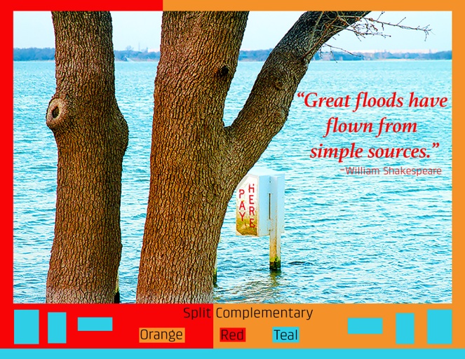
Description: Photodesign poster showing good use of photo skills along with skills of using Photoshop to edit pictures and incorporating a good color scheme.
Process (Programs, Tools, Skills, FOCUS principles): I began my process by researching the different color schemes and examples in the Visual FOCUS Book. I then used a Canon T7 to take photos around the house and at the lake. I was unfamiliar with the Canon, but had a fun time learning how to focus, zoom, and plan a composition. With the photos I took I was able to use Photoshop to edit and enhance the colors. The color scheme that I chose was Split Complementary and using Photoshop really helped bring those colors out even more. Using the eyedropper tool in Photoshop allowed me to design a layout with colors from my image. I used the color wheel from the Visual FOCUS book to help guide me with my color scheme.
Message: I wanted to design a poster for my portfolio that I could use for a potential employer to show them that I understand how to use Photoshop as well have a good understanding of the color wheel and different color schemes.
Audience: Those interested in uplifting messages and quotes.
Top Thing Learned: In the past I have always picked colors on how I like how they went together, but after this week I now have a much better understanding what colors look good together and all of the different color scheme option.
Color scheme and color names: Split Complementary: Orange, Teal, Red
Title Font Name & Category: Athelas Bold Italic-Serif
Copy Font Name & Category: Klint Std Regular-Sans Serif
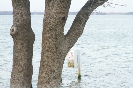
Thumbnail of original, unedited image inserted:
Date and location you took the photo:
February 1, 2016, Grapevine Lake, Grapevine Tx

Nice project. I really liked the color scheme and like you I also was used to using colors that were pleasant to my eye. This project opened my eyes as well to the different possibilities of color. I think you used a very nice color scheme to go with a very nice picture. I think you did a very good job on this and have to say I always like looking at your art. You have a keen eye and are very creative.
If you want, here is a link to my project which contrasts your with darker tones and a different feel:
LikeLike
Thanks for the kind comment! I will definitely go check yours out now.
LikeLike
The photo you chose is awesome. Not sure if it’s a flood or a lake (hoping it’s not a flood…) but it looks so cool. I love the colors of the whole thing and how much they contrast and help to illuminate the values of the other colors (hope that makes sense). I like that the color separators are not symmetrical. Great job, looks really good.
Here’s another great post – https://cchardycom.wordpress.com/2016/02/06/project-3-photo-design/
LikeLike
Wow! I am really impressed at how you enhanced the photo. It’s bright and colorful without seeming fake or over-saturated. It plays really well into your color scheme. I liked noticing the subtle alignment of the red/orange border with the tree trunk. Also the quote you used was very appropriate. All in all, well done!
Here is a link to my project this week: https://loganwroteit.wordpress.com/2016/02/06/project-3-photodesign/
LikeLike