Description: A trifold folding brochure
Process (Programs, Tools, Skills): I set up the trifold brochure in InDesign creating a grid, including 3 columns.
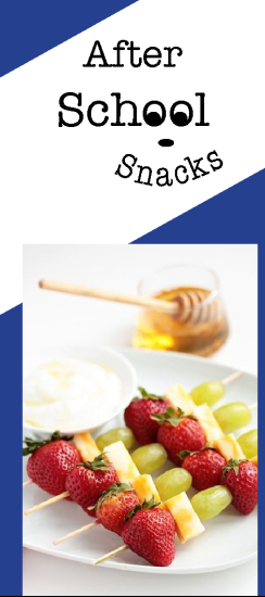
The “After School Snacks” logo was created in Illustrator and I used the type on a curve option to curve the word snacks into a smile, and by adding two small dots in the O’s in the word School, create two eyes for a fun and happy look.
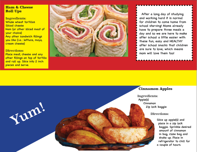
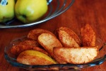
I was able to remove the background of the image of the Cinnamon Apples by using the quick selection tool in Photoshop and also used the eraser tool to erase and soften the edge of the right side of the bowl, where the image was cut off. This really helped to create the look of the edge of the bowl.
For the Cinnamon Apples recipe I chose to wrap the text around the image by selecting “text wrap” option in InDesign.
Message: Fun, easy and healthy recipe ideas to make for kids after school, as well as a website to go to for more recipes.
Audience: Caregivers after school (most often mothers)
Top Thing Learned: I now know how to remove the background of an image and wrap text around that image in InDesign.
Color scheme and color names: Primary color scheme-Red, Yellow & Blue
Title Font Name & Category: Superclarendon-Serif
Copy Font Name & Category: Chalkboard SE-Sans Serif
Word Count of copy: 303 words
Thumbnails of Images used:
Sources (Links to images on original websites)
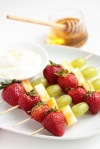
http://www.mybakingaddiction.com/fruit-and-cheese-kabobs-recipe/
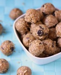
http://www.isthisreallymylife.com/2013/03/pinterest-no-bake-energy-bites/
http://www.superhealthykids.com/cinnamon-apple-smacks-healthy-snack-in-a-flash/
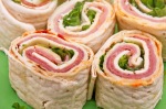
http://www.infobarrel.com/7_Healthy_After_School_Snack_Ideas

Hi Jen,
I really loved your that you put recipes into your brochure. I also loved that you made the oo’s in school into eyes. Very clever! The triangles were really nice and added some interest to your brochure. I loved your color scheme (I used the same one)! Here is a link to my blog post if you would like to check it out. https://cindygoestoschool.wordpress.com/2016/03/25/project-8-brochure/
LikeLike
Hi Jen,
What a fun brochure! I love that you used primary colors, it’s bright and appealing to the audience. I really loved that you included recipes. I even tried the protein bites. They were yummy! Great job on your brochure!
Here is a link to Kristen’s blog: https://kristenkeough.wordpress.com/2016/03/25/p8-brochure/
LikeLike
I have enjoyed seeing all the updates to your brochure. One thing that caught my eye on the video was how rich the colors look when you open the brochure. The red, yellow and blue look great. If you were to work on this project again, I would pull some of the red and yellow into the front and back. If you haven’t had a chance to check out Cindy’s brochure yet, you should stop by. She did a great job on a brochure for a family gathering. https://cindygoestoschool.wordpress.com/2016/03/25/project-8-brochure/
LikeLike